
The Science of High-Converting Landing Pages
Your landing page isn’t just a webpage. It’s the handshake. The elevator pitch. The split-second decision point where strangers turn into customers, or disappear forever. In under five seconds, people scan, judge, and decide: Is this for me? Can I trust this? Is it worth my time? Most businesses obsess over traffic, ads, SEO, growth hacks. But they ignore the one place where it all either compounds, or collapses.
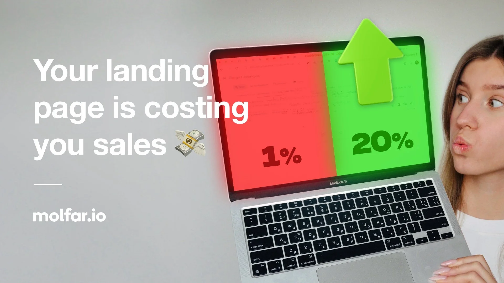
A landing page that doesn’t convert isn’t neutral. It’s expensive. And every day it underperforms, it quietly costs you leads, sales, and momentum.
In this guide, we’ll break down the essential elements of high-converting landing pages, from compelling copy to irresistible CTAs. Whether you’re launching a product, promoting your app, growing your email list, or driving sign-ups, these strategies will help you turn visitors into customers. Let’s go!
Tip #1: Never Start with Design. Focus on Message First
Never start with fancy effects or gimmicks, no matter how tempting. A landing page is fundamentally a means of communication to a potential customer. The primary goal is to convey your core message and value proposition clearly. The visitor should immediately understand what you’re offering or trying to say; everything else is secondary.
It sounds obvious, but nine times out of ten, teams start by dreaming up how to make the landing page sensational, impressive, and viral, often hunting for a cute gimmick. This is a mistake that usually leads to a flashy but hollow result. Begin with the idea and the message you want to get across. Think of special effects as spices in a recipe: to be added at the end for flavor, not the main ingredient.
Content comes before style. Once you have a solid concept and message, you can always enhance the presentation with visuals & effects later.
Idea
Every great landing page starts with a strong idea – this is the foundation that determines success or failure. The idea is a brief description of your concept: it defines what the landing page is about, how it will present the offer, and why this page should succeed in engaging your audience. When formulating an idea for a landing, identify the key message you want to deliver. In practice, write down ideas as short notes or one-liners capturing the essence of the concept. These notes don’t need to be polished, they’re just for you.
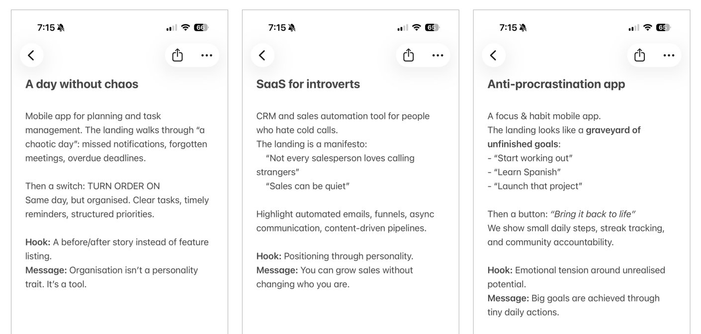
Examples of landing page ideas
Coming up with a good idea can be both difficult and simple. It’s difficult because there’s no step-by-step formula for generating a brilliant concept. Ideas rarely appear on-demand. Instead, they tend to strike when you’re occupied with something else. For example, while walking, reading a book or watching a movie. Be open to inspiration from unrelated activities, and find your own personal way of sourcing ideas (tip: stepping away from work helps creativity).
On the simple side of working with ideas – as soon as the seed of an idea comes to you, a basic intriguing hook or angle, just write it down immediately. It takes just a few seconds to write down the core idea before it fades. The raw note doesn’t have to be pretty. The key is to capture that core insight which might later grow into a full concept. After an idea emerges, it usually seems brilliant in the moment and you’ll feel the urge to start executing it right away. Don’t rush. Give the idea a day or two to settle in. Revisit it with fresh eyes. If it still excites you after a short break, then proceed to develop it. If not, you may refine it or come up with a better idea before investing time in the wrong direction.
Scenario and Narrative Structure
So you’ve got a strong idea and a clear message. Now it’s time to work on the scenario: the narrative structure or outline of your landing page. The scenario is the backbone of the page: a sequence of meaningful sections or blocks that will communicate your story step by step. In this stage, you break down your main message into a series of simpler sub-ideas, each of which will be presented as a section of the landing page. When a visitor reads through all these sections, the sub-ideas should piece together to form the overall message in the reader’s mind.
While planning the set of sub-ideas that support your main idea, keep three factors in mind:
Sub-idea essence: Each sub-idea should be straightforward, something you can easily prove or demonstrate on the page. Collectively, all the sub-points must add up to substantiate your main thesis or value proposition. If a sub-point doesn’t clearly tie back to the main message, consider dropping it.
Number of sub-ideas: Use as few as possible, ideally 2-3. No more than five. If you present too many points, you risk losing the reader’s attention before they reach the end. An information overload will dilute what they retain. It’s better the visitor remembers one or two key things than forgets all ten.
Order of presentation: Rarely are all your sub-ideas equally important, so think carefully about sequence. Remember that reader attention is limited, especially online. You need to hook them early and then maintain interest. Best practice: the first sections grab attention and build interest, and the later sections drive the message home and lead into the call-to-action. In other words, front-load the most compelling content and ensure a logical flow toward your conclusion.
At this stage, it’s useful to work lo-fi. Resist the urge to start designing anything fancy yet. Sketch your outline with a pencil and paper or a simple tool. This kind of lightweight outline is extremely valuable: it’s easy to shuffle sections around, see if something’s missing or extraneous, and iterate on the flow before any heavy lifting is done.
Avoid jumping into design too soon. This is a common mistake among less experienced specialists. Often, newbies try to skip scenario and make it look pretty asap. They might assume that a beautiful visual design can compensate for a weak narrative. This actually make things worse. The flashy design masks underlying structural problems. It become harder to spot issues in the logic of the content because the focus shifts to visual elements. A pretty but incoherent landing page is worse than a plain one that clearly communicates a message. If something isn’t working at the scenario stage, no amount of visual sugar will save it – you’re better off stopping and fixing the content outline (or even killing the idea altogether) before investing in design and development.
If you find your scenario isn’t coming together, for instance, if the sub-ideas aren’t logically proving the main idea, or the narrative feels disjointed – take it as a red flag. Be willing to kill a landing project at the scenario stage if it’s not producing a compelling story. It’s painful to throw away work, but far better to fail fast in planning than to push through and end up with a confusing page. Often teams feel “we’ve already put in effort, and the design looks nice, so maybe we should just keep it” – but that sunk cost thinking results in mediocre outcomes. Instead, be brutally honest: if the narrative doesn’t make sense, either rework the outline or scrap the idea and move on. Remember, a simple text message on a white page that clearly says what you mean is better than a beautifully designed page that leaves users puzzled.
Finally, what should the overall structure of your landing page be? This can vary; there is no one-size-fits-all formula. The main goal is to avoid confusing or boring the reader. If you’re stuck, use a classic storytelling structure we all learned in school: introduction, body, and conclusion. In landing page terms, that translates to: a Teaser (hero page), the Main Content (body), and a Call-to-Action as the conclusion. This simple framework ensures you have a clear beginning, middle, and end to your page’s story. Once you have this outline scaffold, you can get creative within those sections – but at least you won’t forget to include an opener to hook the audience and a finale that prompts them to act.
Teaser
The Teaser is the first page a visitor sees on the landing page. The teaser’s job is to immediately grab the visitor’s attention and entice them to continue exploring the page. This element is critical for two reasons. First, the teaser largely determines how many people stay versus how many bounce right away. If it fails to spark interest, a chunk of visitors will lose interest and leave. Second, in any information sequence, people tend to remember the beginning and the end the most. So if a visitor remembers anything from your landing, it will likely be the teaser and the call-to-action. A powerful start increases the chance they’ll not only stay longer but also retain your message.
Because the teaser is aimed at a visitor who isn’t yet invested, you must catch them as quickly as possible. Make the teaser text punchy and concise. In an ideal case, a visitor should be able to get your teaser within a few seconds and feel intrigued to learn more. This often means a bold headline, a striking image, or a combination of both that conveys just enough of the idea to hook curiosity without overwhelming.
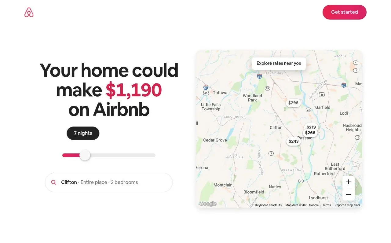
A bold teaser by Airbnb that immediately captures your attention: “Wow, I can make $1,190”
Teasers generally grab attention in one of two ways: either with an interesting piece of text or with an interesting visual. For example, some effective teasers are basically just a brilliant headline or tagline that piques interest, while others might be a compelling hero image or illustration that draws the eye. You can choose either approach (or a mix), but don’t procrastinate the creation of your teaser – it’s too important to leave until the end. Despite being just a small part of the page, coming up with an excellent teaser can be surprisingly challenging and time-consuming. In fact, crafting the perfect teaser might take more effort than all other parts of the landing combined, because you’re trying to condense the essence of your pitch into a very compact form.
That said, inspiration for a teaser can come from unexpected places. Occasionally, your own customers or audience might supply the perfect catchy phrase (in AppStore reviews, testimonials, etc). Keep your ears open for language or imagery that resonates with your audience; real user sentiments can sometimes be more compelling than anything marketing teams write in a vacuum.
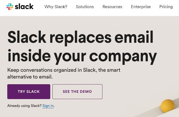
Slack’s early landing page nails it: speak with conviction (e.g., say the bold “replaces,” not the softer “alternative”)
In short, make your teaser count. Aim for a hook that is both grabbing and relevant, something that speaks to your target users and makes them want to read on. Whether it’s via a brilliant bit of copywriting or an eye-catching visual (or both), ensure your landing page’s first impression is a strong one.
Main Content (Body)
The Main Content section is the core of your landing page, the meat in the sandwich. This is where you present the arguments (aka sub-ideas) that you mapped out during the Scenario stage. Each sub-idea will likely correspond to a section of content with its own heading, text, images. Together, these sections should form a coherent narrative that leads the visitor to understand and accept your overall message. Ideally, by the end of the main part, the visitor’s mind has assembled all the pieces into the “big picture” you want to convey.
When working on the main content, be very mindful about what points you include, how many you include, and in what sequence. This echoes the earlier guidance on scenario planning: less is more, and order matters. It’s a good practice to write down all your sub-ideas (key points) on separate notes and then try rearranging them in different orders to see which flow makes the most sense. Begin drafting actual headings for each block at this stage, because a clear, concise heading can encapsulate the point of a section and help you judge if the logic flows. If you can organize your main ideas into a clear list of short section headings, and they already sound convincing, you’re on the right track.
Depending on your project, the main content can be very straightforward or quite involved. For a simple landing page with one clear proposition, the main part might be just a few bullet points or features. For more complex offerings, or when you have many potential angles and need to decide which to highlight, this stage can require deeper analysis and research. Sometimes you’ll need to gather data, compare different approaches, or even do a mini-competitive analysis to determine which points will be most effective to present.
Eg, you can create a mind map evaluating different content structures. This mind map allows you to visualize various possible narratives for the page. Gathering the information can take some time, and analyzing it and making a decision, too. But this investment is worth it: for an important, content-heavy landing like a major product page, doing this work ensures you’re building on the best possible story.
Not every project will need such exhaustive analysis (eg, simple campaigns or contest pages might not). However, even in simpler cases, you should still break the information into logical pieces (e.g. if it’s a contest: what it is, the prize, dates, how to participate, etc.) and then determine the most effective sequence to present those pieces. The goal is always to guide the visitor through a narrative that is easy to follow and convincing, without any gaps or unnecessary detours.
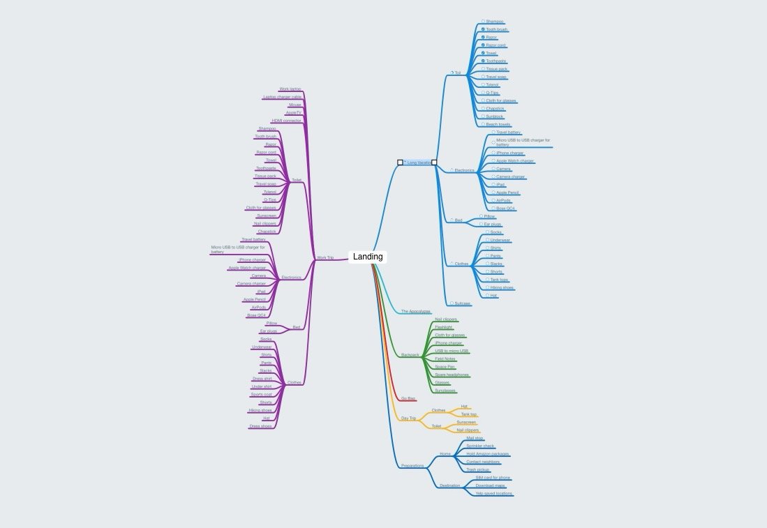
Mind map example
Call to Action
Since a landing page is a form of marketing communication, it should always end with a clear call to action (CTA) – a prompt for the user to do something. After investing their time reading your page, the visitor should know what you want them to do next. If your landing page is informative and interesting but just ends abruptly, like a movie ending with “The End”, you will lose the opportunity to convert that interest into a concrete result. Whether you want the user to sign up for a trial, request a demo, download an app, subscribe to a newsletter, or even just share the page, you need to explicitly encourage that action. Otherwise, you’ll end up with a “marketing facepalm” – a situation where you had the user’s attention but failed to capitalize on it.
In practice, a CTA is usually presented as a prominent button or form at the bottom of the page. Make sure your CTA is specific and enticing. For example, “Get Started Now,” “Try X for Free,” “Join the Beta,” etc., rather than a vague “Submit” or “Send”. Ensure that it logically follows from your page’s content. The visitor should feel that clicking that button is the natural next step after agreeing with the great points you’ve made. In summary: never leave the user at a dead-end. Even if your goal is just to impart information, consider adding a CTA like “Learn more on our blog” or “Contact us for details” so that interested readers have someplace to go. Always guide your visitor to the next action.
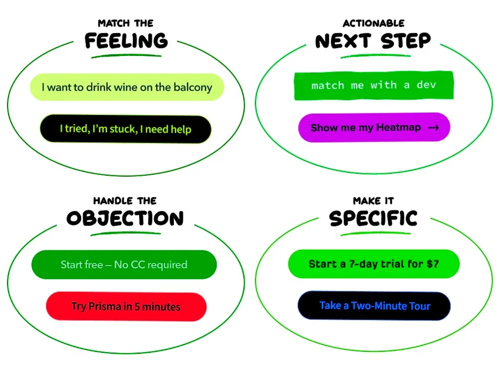
Call-to-Action (CTA) Button Examples
Finalizing the Outline: Check the Narrative Flow
Once you have a draft scenario (outline of teaser + main content + CTA), how do you verify that it’s solid and not a garbage? One technique is to summarize each content block in a short phrase (often these end up being the section headlines later) and write them out in order. Then, read these phrases in sequence and see if they tell a compelling story. Ask yourself: Does this sequence make sense? Does it capture attention, build interest, and ultimately deliver my main message?
If the “story” that unfolds from your headings alone doesn’t feel engaging or logically complete, you likely need to tweak the scenario: perhaps reorder sections, cut something, or clarify your sub-ideas, and test it again. If the skeleton story does work and you can essentially grasp the whole pitch just from those one-liners, then you’re ready to move on to writing the full content.
At this stage, it might also help to step back and consult general principles of storytelling and communication. Here are some classic reading that can help you:
Aristotle’s "Poetics" – a foundational work on dramatic theory that covers how to structure a story.
Barbara Minto’s "Pyramid Principle" – a well-known guide on structured communication, often used in consulting, which teaches how to present ideas in a logical, pyramid-like order.
These references underscore that creating a good narrative follows certain timeless practices: having a clear structure, making every element serve a purpose, and leading the audience toward a conclusion. While you don’t need to read these to craft a landing page, the point is that structured thinking matters. If your outline follows a strong logical progression, you’ll save yourself headaches later on.
Once you’re confident that your landing page outline works well, it’s time to expand it with the full written copy.
Copywriting (Text Content)
The quality of the text is a direct indicator of a landing page’s overall strength and the professionalism of its creators. It’s disappointing to see a beautifully designed, well-formatted landing page with weak text. Such cases happen, because teams sometimes treat design and text as interchangeable ways to convey an idea. It’s true that almost any idea can be communicated either through copy or through visuals. However, people often assume that working on visuals will be more fun or impactful, and thus they neglect the copy.
This leads to the common scenario where rookie marketers try to skip the heavy writing work and jump straight into collaborating with a designer. We have seen newcomers do things like rush to a designer and say: “Let’s start drawing a cool page. We’ll put a picture of a nice iPhone with our app here, a picture of a happy girl there, and we’ll figure out some text like ‘awesome app’ or something about ‘simplicity’ later.” The result, unsurprisingly, is rarely effective. Without solid copy, the page ends up with pretty graphics but a weak message.
Neglecting copy is a serious mistake. Here is why focusing on text is crucial:
Text is a powerful standalone communication channel. If you ignore it, you’re throwing away an entire medium of persuasion. Great copy can achieve things that visuals alone might not, so don’t leave that opportunity on the table.
Relying only on design is risky. Design can and does amplify a message, but if you put all your eggs in the design basket, any failure in design means the message fails too. Text provides a parallel supporting path to communicate your idea. Think of it as redundancy in the best sense: even if a user skims past a graphic, a strong headline might catch them, or vice versa.
Good text actually makes design easier. The best design brief you can give a designer is a well-written piece of text. If the writing clearly explains the idea, the designer doesn’t have to guess how to communicate it. Instead, the design can highlight and support the message in the text, rather than trying to create meaning on its own. When the words and visuals work together like this, the result is stronger and the page feels more unified.
So, have your copy before moving on to the design stage. This might be the least exciting part of the process for many, but writing is the decisive stage of creating a landing page. If you’ve ever been tempted to skip or rush writing, remember that your landing’s success hinges on it. Good copywriters can be hard to find, so be prepared to roll up your sleeves and do it yourself if needed.
Writing great copy is hard work. As the saying goes, "Writing is the art of applying the ass to the seat", meaning you’ll be sitting and rewriting multiple times until the text is just right.
One practical exercise you can use to test the strength of the text is to create a text-only mockup of the landing. Take all the written content: headlines, subheadings, body paragraphs, CTA wording, and write them out in order on a plain document (no design, just text). Then read through it as if it were the landing page. If the text is really good, a kind of magic happens: the landing already “works” even without any design. The teaser grabs your attention. As you keep reading, your imagination starts to form pictures. The ideas connect and build toward a clear message. By the time you reach the call to action, it feels natural and convincing. It becomes a prototype of the landing page, like a bare-bones HTML page with no CSS. If this text-only landing can create the intended impression on a reader, you know your copy is effective. If the text-only flow is boring or confusing, no amount of stunning graphics will fix that. This test is a high bar, but striving for it will push you to refine your copy.
There are a few additional criteria you can use when refining text:
Brevity and Clarity. Landing page text should be as short as possible while still conveying the message and emotion. This often means a lot of editing. You might rewrite a three-word headline ten times to find the perfect phrasing, or condense a paragraph into one sentence. Every excess word that can be removed without losing meaning should be removed, and if you can replace a phrase with something shorter and punchier, do it. Achieving concise, understandable, and impactful text is the ultimate copywriting skill for landing pages.
Multiple Rounds of Revision. Be ready to rewrite and then rewrite again. Sometimes rewriting even tiny bits of text over and over. It can be painstaking, but that’s what it takes to get to clarity. Don’t be precious about your first draft, iterate.
Consistency of Voice and Tone. The text should speak in a voice that suits your brand and audience. For instance, it can be a friendly, straightforward tone in communications, so your landing copy should reflect that. Make sure your tone is appropriate and consistent throughout the page.
Bottom line: don’t skimp on copywriting. It may not be glamorous, but it’s what ultimately sells your idea. Aim to have your text in such good shape that even without any design, it could stand on its own. Once you have that, you’re ready to make it visually attractive.
Design
Yes, we’ve just gotten to the Design stage. Often the most enjoyable part, especially if you’ve done all the prior work properly. If you’ve followed the process up to this point, by the time you involve a designer you should have a great set of ingredients ready: a one-paragraph idea, a detailed scenario/outline, and a complete, strong text that engages and convinces the reader. With this foundation, the role of design is to elevate and complement the content, to make the page aesthetically pleasing, guide the eye, and reinforce the messages. This makes the designer’s job much clearer and more focused.
All you need now is a skilled designer to bring it to life. Share your idea, outline, and copy with the designer, and maybe spend a little time together to walk them through your vision and infuse them with your enthusiasm. This kickoff helps ensure the designer understands the story you’re telling and what feeling you want to evoke. If you have examples of designs or styles you like (mood boards, references from other sites, etc.), show them to the designer at this stage. It can save time by providing a sense of direction: visual preferences, brand guidelines, and so forth.
Be prepared for iterations. It’s rare to get the design perfect on the first try. The key is to give feedback early and clearly. You can comment directly on the mockup in Figma. Or you can take images and use the Markup tool on iPhone/iPad with a bright-colored brush to scribble feedback and notes right on top of the design. Send these marked-up images back to the designer. This way, there’s no ambiguity – the designer can see exactly what you’re referring to (e.g., “make this text bigger,” “try a different image here,” “this part isn’t clear”, etc.).
It’s important to note that at the design stage, you’re not in a position to just sit back like a picky client and say “I don’t like it, change this” without involvement. Instead, think of the design phase as the moment when all the parts of your project come together as a functioning machine. You, as the project owner, are as much a part of assembling this machine as the designer is. That means if something isn’t coming out right, the issue could be with the design implementation or it could be due to a flaw in the earlier stages: maybe the structure is a bit off, or the text is too long or unclear in places. Many of the shortcomings from previous steps will surface during design. For example, you might discover that a section feels redundant or the flow is awkward, something you didn’t notice until you saw it visually laid out. Or you might find that a paragraph is way too long once placed on the screen. This is the time to catch those problems.
Your task as the project lead is to spot these issues and resolve them promptly. That could mean rewriting some copy on the fly, splitting a section into two, swapping the order of blocks, or even going back and tweaking the core idea. Do not try to pressure the designer to “make it work somehow” purely with visual tricks if the content or structure is flawed. Be brave enough to acknowledge when a mistake from earlier is causing trouble now, and fix it at the root. This collaborative, ego-free approach will result in a much better final product.
On a practical note, once the design is nearly complete, don’t forget about the details like proofreading. Always show the finished design mockup to a proofreader to catch any spelling or grammatical mistakes. Do this after the text has been laid into the design, because sometimes errors stand out once you see the text in context (and you might also tweak wording during design). A clean, error-free copy is part of a professional website.
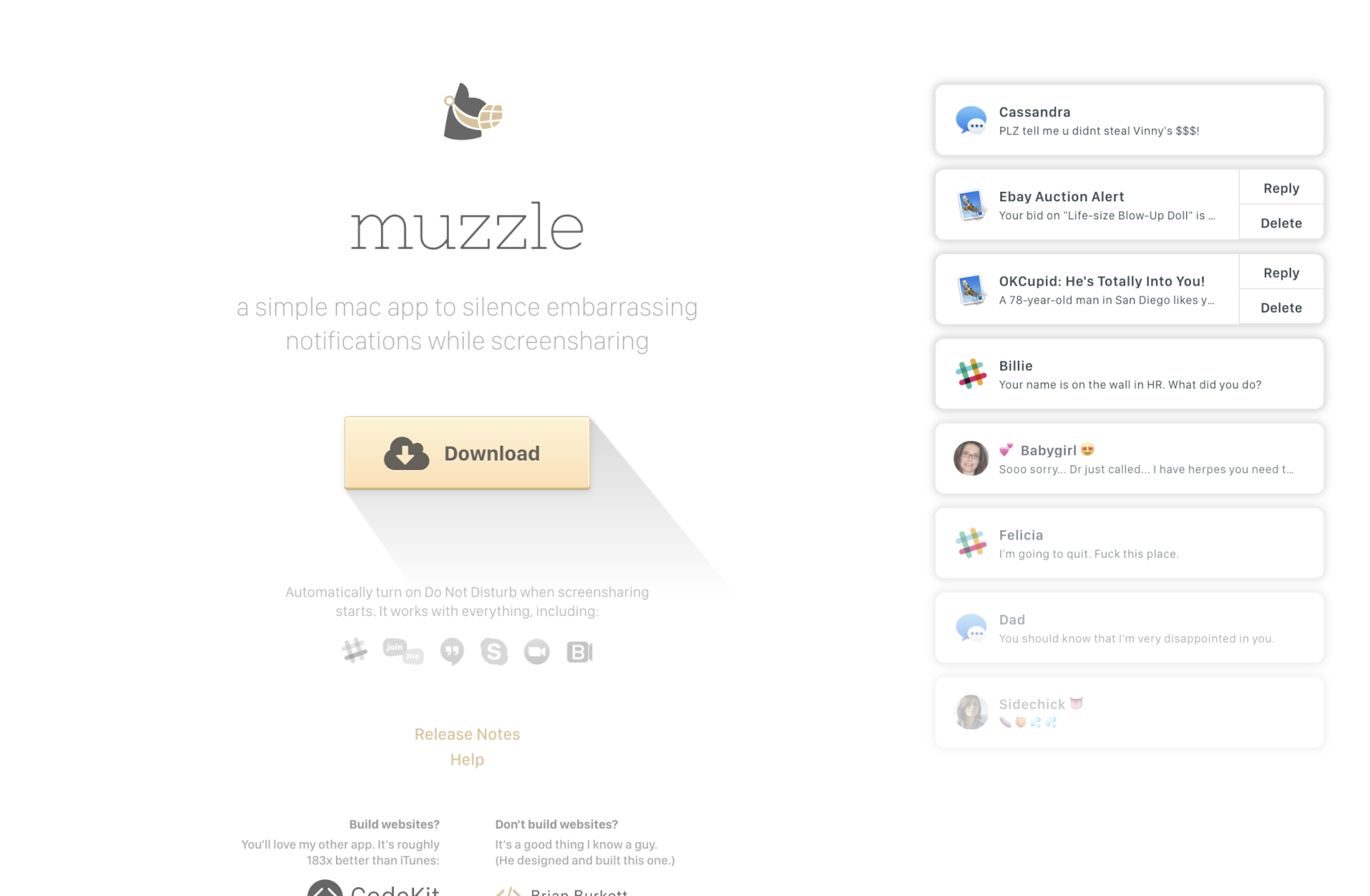
When you open Muzzle’s landing page, it simulates awkward push notifications popping up on your screen. It’s a great example of how a bold idea, executed with strong visuals, can instantly communicate a product’s value.
A Note on Visual Assets
As part of the design process, you’ll need images, illustrations, or other visuals to support the content. The simplest route is to use stock photography or stock graphics from libraries like Shutterstock, Adobe Stock, Unsplash, etc., and indeed designers often use these resources. There’s nothing inherently wrong with stock images, many can fit nicely into a design. However, poor AI-generated images or too popular stock photos can make a landing page feel less authentic.
This isn’t to say you must never use stock imagery (time and budget can be real constraints), but consider options for more genuine visuals. Original graphics or photos created specifically for your landing page can make a big difference in how trustworthy or alive it feels. If hiring a pro photographer or illustrator is feasible, it’s often worth it. If not, even DIY photos are better than nothing – today’s smartphones and basic editing tools can produce decent results, and the current trend actually favors a more informal, authentic look in many cases. Taking your own shots might not yield the glossy perfection of stock images, but it can bring a relatable vibe that polished stock sometimes lacks. Plus, it ensures your visuals are unique to your brand.
Frontend Development
Once the design is approved, it’s time for coding – turning the design into a live web page. In this stage keep the implementation simple when possible, and use a capable developer.
Firstly, try to avoid any crazy special-effects or overly complex technical tricks that would make the page hard to code or prone to breaking. Fancy animations and interactive elements can be alluring (and sometimes they serve a purpose), but if they’re not essential to your message, consider leaving them out. The more complex the front-end, the more room for bugs or display issues, especially across different browsers and devices. A clean, streamlined page that works everywhere will outperform a super flashy page that only works on a high-end computer. So if you can achieve your communication goals without heavy scripts or intricate effects, do so – it’s always better to keep it simple.
That said, even a simple design needs to be coded well. We strongly recommends hiring a good frontend developer rather than trying to cut corners with cheap specialists. It might be tempting to save money by using a novice, but consider that skimping here doesn’t save much in the grand scheme, and it can cost you a lot of time and headaches. Why? Because any flaws in the markup will be immediately evident once the page is live – users will start sending you screenshots of things that look wrong or don’t work. Issues like broken layouts on certain screen sizes, elements overlapping, or the page not loading correctly can quickly tarnish the impression you’ve worked so hard to create. A skilled developer will ensure the page is responsive, loads fast, and looks as intended across devices, so you don’t get unpleasant surprises.
Alternatively, you can use zero-code tools. For most startups, such tools are more than enough. Platforms like Squarespace allow you to ship polished, responsive, SEO-ready landing pages without touching a single line of code. In fact, we use Squarespace very often. Why? Because it lets us move fast. We can implement the full strategy (structure, copy, visuals, conversion logic) in days, not weeks. The performance is solid, the design system is clean, and integrations (analytics, forms, payments, email capture) are straightforward. But the real advantage isn’t speed, it’s independence. After launch, non-technical founders can update headlines, swap visuals, tweak offers, run experiments, and maintain the page themselves. No dev tickets. No sprint planning. No waiting. Unless you’re building something highly technical or deeply customized, zero-code tools are not a compromise, they’re a strategic advantage.
One specific tip for the coding stage: don’t forget to prepare your page for social sharing. This means adding the appropriate meta tags (such as Open Graph tags for Facebook, Twitter Card tags, etc.) in the HTML head. These tags tell social networks what content (title, description, image) to display when someone shares your landing page link. If you omit this, the social network will automatically pull some random snippet of text and an image from your page, which might not be ideal. For example, it might grab a menu label or a background image instead of the nice intro text and hero image you intended. That could result in an ugly or confusing preview when the link is shared. To avoid this, explicitly specify the sharing thumbnail and description.
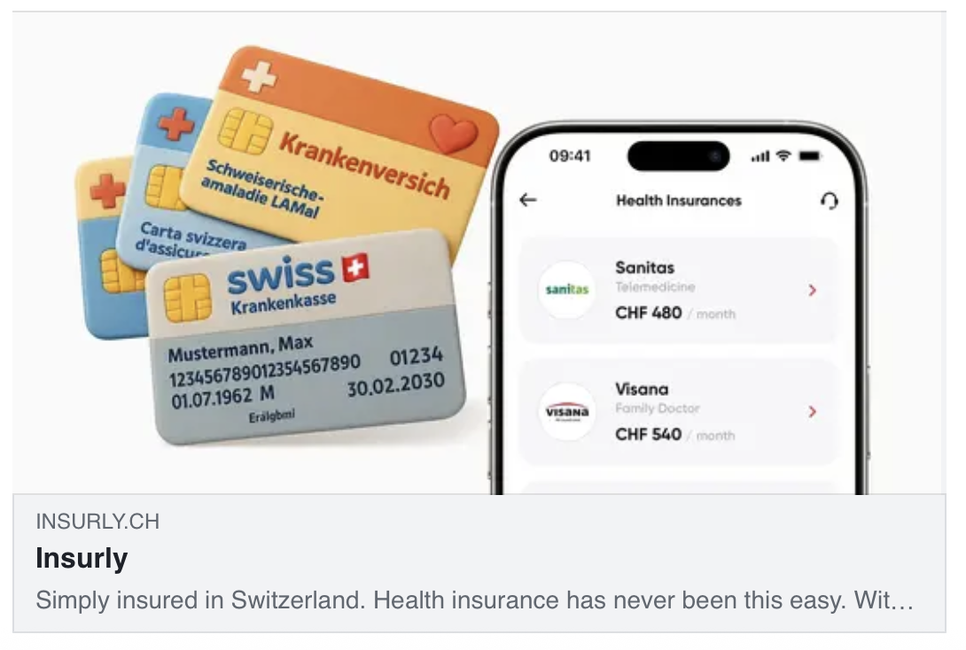
Example of a social share image & text for our project Insurly.
Prepare a catchy line and a beautiful image that represent your page well. That way, when visitors do share your page (hopefully they will!), it will shine in social media feeds with the content you choose. Creating those share assets and ensuring they’re in place is your responsibility as the project owner at this stage. Don’t assume the developer will handle it by default – make it part of your checklist.
With design and coding done, you’re ready to launch the landing page. But before we conclude, let’s touch on two practical aspects: how long this process takes and what it costs.
Timeline
How long should creating a quality landing page take? The typical project spans about 1–3 weeks, from start to finish. This timeline can vary depending on complexity and scope, but it’s a useful benchmark for a small-to-medium project (like a promotional landing or a product intro page). Here’s roughly how this time breaks down by stage and role:
Idea: ~1 day (in practice, coming up with the idea can take days or weeks of inspiration, but we allocate about a day in the schedule for finalizing the concept, testing it on colleagues, and kicking off the project)
Scenario/Outline: ~2–3 days (outlining the narrative, deciding on sub-ideas and structure)
Copywriting: ~3–5 days (writing and refining all the page copy)
Design: ~3–4 days (multiple iterations of visual design)
Coding: ~3 days (implementing the page and doing revisions/QA)
These stages often overlap among team members. For example, the project lead is involved from the idea through to launch, guiding each phase. A copywriter might primarily work during the copywriting stage, a designer during the design stage, a proofreader in late design or early coding, and a frontend developer during coding.
TL;DR and Key Takeaways
To recap all the advice, here’s a summary list of key tips and principles:
Start with the idea and message, not with special effects. Don’t begin by obsessing over visuals or gimmicks – focus first on what you need to communicate and why it matters.
Capture ideas whenever and however they come. Great ideas often strike at unexpected moments and rarely on-demand. Write down every idea as it comes to you, even if it’s just a rough note.
Let your idea sink in. After coming up with a concept, give it a day or two before acting. Test the idea on colleagues or friends. If it still holds up and excites people, proceed.
Outline your scenario. With a solid idea, break down your main message into supporting points or sub-ideas. These will become the sections of your landing page.
Keep the number of points minimal. Don’t overload with too many sub-ideas. A few strong points (up to 5 max.) are easier for readers to digest and remember.
Structure matters. Arrange your sub-ideas in a sequence that flows logically and keeps the reader engaged. Lead with the most compelling info, and build up to your call-to-action.
Use low-fidelity tools in the planning phase. While working on the scenario, resist diving into elaborate design. Sketch your outline with pencil and paper or simple wireframes. This makes it easier to toss or rearrange ideas.
If unsure about format, stick to the classic structure. Introduction → Body → Conclusion is a time-proven format. In landing page terms, that’s Teaser → Main content → CTA. It ensures you have a hook at the start and an offer at the end.
Once the outline is set, invest in copywriting. Don’t skip or put off writing the text. Even if it feels tedious, writing the copy is a crucial step in creating an effective landing page.
Be prepared to write the text yourself. Truly great copywriters are hard to find. You might need to roll up your sleeves and do it, especially to get the authentic message you want.
Rewrite until the text is great. Good text usually comes through iteration. Revise headlines and paragraphs multiple times. Aim for clarity and impact with as few words as possible.
Test the text on its own. Your goal is text so effective that even without design, people get the idea and feel compelled by your offer. If readers can visualize the value and feel interested just from reading your copy, you have a winning text.
Make it short. Keep your landing page short and clear. Strong copy shares the message and feeling in the simplest way possible. Remove any unnecessary words.
Good text guides good design. A well-written text serves as an excellent brief for the designer. If your copy is solid, the design’s job is mainly to reinforce it, not to invent meaning from scratch.
Stay alert during the design process. Don’t relax just because a designer is working on it. Watch for problems, whether they’re design flaws or weak spots in your content. Fix issues with your idea instead of hoping the design will hide them.
Include social-sharing info. When coding, remember to add a custom preview image and description for social networks. If someone shares your page, it should look awesome in the link preview, not generic or broken.
Plan for about 1–3 weeks of work. A strong landing page usually takes a few weeks to go from idea to launch, so plan your timeline carefully. If you try to finish it in a day or two, the drop in quality will likely be obvious.
There are no rules. Finally, remember that creating landing pages isn’t governed by hard laws, it’s a mix of art and science. The above guidelines are based on experience, but you should always do what works best for your context. Treat these principles as recommendations, not ironclad rules.
By following these practices, you set yourself up for a much greater chance of building a landing page that performs well.
Conclusion: Always Include a CTA
It’s a lot easier to create an amazing landing page when you’re genuinely excited about what you’re selling. People can tell when you truly believe in every point you’re making. It just feels different. When you’re sold on your product’s value, that confidence naturally comes through in your writing, and you’ll instinctively focus on what makes it so compelling.
So, if you want to build a successful landing page, first make sure you understand and love your product. Use it, test it on yourself, and get to know its ins and outs. If there are shortcomings, address them. If there are aspects you don’t yet appreciate, dig deeper or improve them. When you genuinely feel excited about what you’re offering, channel that into your landing page’s idea and copy. That authenticity is hard to fake and is key to gaining your audience’s trust.
Finally, don’t forget to prompt your audience to take action. For example, you could hire molfar.io to plan and design a landing page for your company. See what we just did? We delivered value through this article, and now it’s the perfect moment to include a CTA and turn you into a client. Your landing page should work the same way. After you’ve built value and convinced the visitor, make the next step clear, easy, and appealing.
In summary, creating an effective landing page is part science (following a thoughtful process) and part art (understanding your audience and inspiring them). By systematically developing a strong idea, crafting a clear narrative, obsessing over great copy, and paying close attention to design and technical details, startups can create landing pages that not only look good but also drive results. Remember to infuse it with a genuine belief in your product, and your landing page will speak with a voice that truly resonates. Take these insights, apply them to your own project, and may your next landing page be your most powerful one yet. Good luck!