
Dark Patterns in UI/UX Design. Dirty Secrets of Growth Hacking

A new mobile app promises seamless convenience, until you try to cancel your account and find yourself lost in a maze of menus. This frustrating experience is no accident. It’s an example of a dark pattern in UI/UX design: a deliberate tactic to mislead or trap users for the company’s benefit. Dark patterns are interface tricks that exploit our habits and cognitive biases to nudge us toward actions we didn’t intend. From surprise fees at checkout to prechecked consents buried in fine print, these deceptive designs have quietly infiltrated modern apps and websites. And while they may offer short-term wins – a spike in signups here, an extra subscription there – their long-term consequences can be devastating for startups. In this investigative deep-dive, we’ll explore how dark patterns operate, spotlight real cases of companies that crossed the line, and distill lessons for founders seeking growth without losing user trust.
What Are Dark Patterns and Why Do Startups Use Them?
Dark patterns (aka deceptive design) are essentially UI tricks that manipulate users into decisions they wouldn’t normally make. They play on our assumptions and inattention – the “OK” button that actually opts you into emails, the free trial that silently converts into a paid plan. These designs often exploit cognitive biases. An option preselected in a pop-up or a brightly colored “Agree” button can push a “lazy thinker” (as we all are sometimes) into clicking without a second thought. Startups, under pressure to grow fast, may find dark patterns tempting. After all, if a confusing interface yields more sign-ups or extra revenue in A/B tests, why not use it? Indeed, many businesses have adopted dark patterns to boost short-term metrics like conversions or data collection. As we’ll see, what might look like a growth hack can quickly become a startup’s undoing.
Fast Fact: Dark patterns are everywhere. A Princeton study of 11,000 shopping sites found 1 in 10 used some form of deceptive design. On mobile, it’s even more rampant – 95% of popular Android apps analyzed in one study had at least one dark pattern built in. The problem has only grown: by 2025, 97% of popular apps used by EU consumers contained dark pattern elements.
Dark Pattern Tactics
Dark patterns come in many flavors, each a different method of deceit. Let’s shine a light on some of the most common categories, how they work, and real examples that illustrate their use.
Trick Questions & Misleading Language
One classic dark pattern uses confusing wording to nudge users into choices they don’t want. These “trick questions”often appear in consent forms, pop-ups, or checkout processes. By employing double negatives or ambiguous phrasing, the interface prompts you to do the opposite of what you think. For example, a dialog might ask: “Don’t uncheck this box if you do not want to receive updates.” Huh? Many users simply click “OK,” inadvertently agreeing to something. This tactic thrives on confusion – the user doesn’t realize they’ve been misled until it’s too late.
Mobile apps and websites also use misleading copy to drive up engagement or revenue. Consider a promotional pop-up offering a perk: “Free Shipping” for your order, accompanied by a tiny info icon. It sounds harmless – who doesn’t want free shipping? – so you tap it. Only later do you realize that checking that box enrolled you in a $29.99/year subscription program for “premium” shipping service.
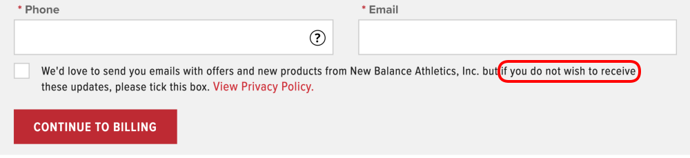
Trick Questions on newbalance.co.uk. Normally, checkboxes are designed to be ticked to opt in. Here the user is required to tick to opt out.
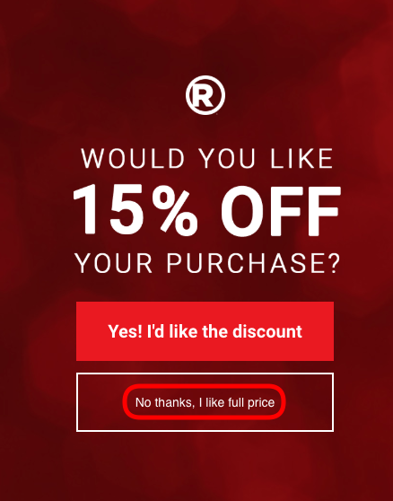
Confirmshaming
Confirmshaming is a related ploy: it uses charged language to guilt users into compliance. You’ve likely seen this in email sign-up forms or app dialogs. The “Accept” button will be bold and bright, while the “No thanks” option is a snarky quip like “No, I prefer to stay uninformed” or “No, I’d rather bleed to death.” Yes, that last one is real – a health supply site used “No, I’d rather bleed to death” as the opt-out text for a first-aid kit offer. This dark pattern (dubbed confirmshaming) works by shaming the user for declining, making them feel bad or foolish if they don’t comply. It’s an emotional trick, leveraging our aversion to guilt. While it might increase conversions in the moment, it often leaves users feeling annoyed or insulted.
Ethical alternative: Clarity and respect are key. Use normal language for choices. Users shouldn’t need a lawyer (or therapist) to figure out what they’re agreeing to. As a rule of thumb, if a decision prompt can be misinterpreted, rewrite it. Clear copy builds trust, whereas trickery guarantees confusion and regret.
Confirmshaming on radioshack.com. Dismiss the popup is framed to shame the user into avoiding it.
The Roach Motel: Easy to Get In, Hard to Get Out
The Roach Motel design is as creepy as it sounds: users check in easily, but can’t check out. In practical terms, it means signing up or subscribing to a service is a breeze – often a single tap via social login or a one-click free trial – but canceling or deleting your account is hidden behind layers of obfuscation. Many of us have been there: you eagerly join a new service, but when it’s time to leave, you encounter an endless loop of menus, “Are you sure?” prompts, hard-to-find settings, or even requirements to call customer service. The design intentionally exhausts your patience in hopes you’ll give up and remain a subscriber.
One infamous example was Amazon Prime’s cancellation process (prior to mid-2022). Amazon made it frictionless to start a Prime free trial – often via a single mistaken click at checkout – but to cancel Prime, users had to navigate a convoluted, multi-page workflow dubbed the “Iliad” internally. This cancellation flow was so notoriously complex that consumer groups in Norway and the EU lodged formal complaints about it in 2021, calling it a maze of “complicated navigation menus, skewed wording, confusing choices, and repeated nudging”. The sum of these tricks was clearly designed to be obscure and manipulative, aimed at keeping consumers subscribed against their better judgment. Under mounting pressure and regulations Amazon finally agreed to simplify Prime cancellations in Europe to just two clicks. The fact that it took regulatory intervention to get a “Cancel” button prominently displayed speaks volumes about how effective the Roach Motel pattern can be.
Other companies have played the same game. LinkedIn, for instance, made it ridiculously easy to start a premium trial with one click, but canceling that subscription was a treasure hunt. Users reported that LinkedIn swapped the primary and secondary buttons on the cancel page (a subtle trick) so that at first glance you might think you’d canceled when you hadn’t. In another case, a user trying to stop LinkedIn’s email notifications discovered it took navigating through 64 different menu screens to fully opt out. These are classic Roach Motel tactics: make the exit so byzantine that users feel trapped.
The long-term impact of such tricks is toxic. Frustrated users might begrudgingly stay a bit longer, but they’ll also spread the word about how your product locks you in. Worse, they’ll never fully trust you again. The more we keep the user from leaving, the more they want to leave. For startups, that means a churn time-bomb, and a reputation for being user-hostile.
Ethical alternative: Don’t prey on inertia. If your service is genuinely good, you don’t need to hold customers hostage, they’ll stay because they want to. Make account settings and cancellation options easy to find and execute. Not only does this comply with emerging “click to cancel” laws, it also sends a powerful message: that you respect your users’ autonomy. Some of the most trusted brands boast about “no questions asked” cancellations or friction-free returns – it earns goodwill that often brings users back in the long run.

Hard to Cancel on savagex.com. The only way to cancel the $49.95 auto-renewing membership is to call the customer support. Signing up, on the other hand, can be completed online.
Forced Continuity: The Free Trial Trap
Closely related to the Roach Motel is Forced Continuity – a dark pattern that hits your wallet. This occurs when a product automatically converts a free or introductory offer into a paid, recurring subscription without clear warning or user consent. Often, users must provide credit card info for a free trial, and if they forget to cancel by day 7/14/30 (which the company hopes they will), voilà: you’ve been rolled into a paid plan. The “continuity” is forced because the default is to start charging you until you take action to stop it.
This tactic is rampant in subscription services and mobile apps. Think of a video streaming app that offers a 7-day free trial but doesn’t send a reminder before charging your card on day 8. Or a fitness app that quietly moved you from a monthly trial to an annual plan without a clear heads-up. Even industry giants have done this. Adobe, for example, was called out when some users were surprised by annual Creative Cloud renewals – the trial fine print wasn’t obvious, and cancelling early incurred a fee. Many gym memberships (a decidedly old-school example) are notorious for this too: you sign up for a “free month” promo and end up locked into a year-long contract unless you cancel in person via certified letter during a one-day window at midnight.
Regulators label these practices “negative option billing” – essentially assuming your silence is consent to keep paying. The U.S. Federal Trade Commission has had enough; in 2023 the FTC proposed new rules requiring that ending a subscription must be “as easy to cancel as it was to sign up”. It’s also suing companies that play foul. In a scathing 2023 complaint against Amazon, the FTC alleged Amazon used “manipulative, coercive, or deceptive” designs to trick millions into Prime subscriptions and then “trapped people into recurring subscriptions without their consent”.
For startups, forced continuity might juice your early revenue, but it’s a Pyrrhic victory. Users feel cheated when they notice unexpected charges, leading to disputes, refund requests, and furious one-star reviews. It’s the opposite of building customer loyalty. From the legal side, the risk of fines grows, too. E.g., California’s law says any consent obtained through dark patterns is not valid consent.
Ethical alternative: If you offer a free trial or freemium model, be upfront and transparent about the terms. In the long run, voluntary retention (customers who actively choose to pay) beats involuntary churn (customers who feel tricked and then bolt, perhaps via chargeback). Remember, the goal is loyal users, not captive ones.
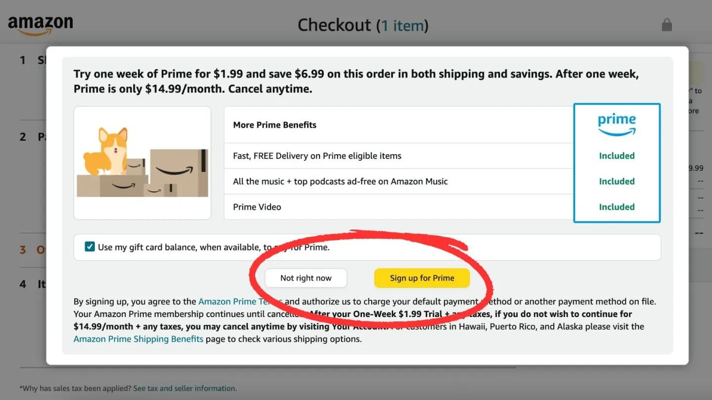
Amazon forces shoppers who aren’t members of Prime to choose whether to enroll in the program before they can finish their purchase.
Hidden Costs and Fees
Few things sour a user’s mood more than hidden costs. This dark pattern occurs when additional fees, charges, or conditions are not revealed until late in the user journey, often at the final checkout page or after a multi-step process. It’s the digital equivalent of bait-and-switch: advertise a compelling price or offer, then hit the user with the real cost after they’ve invested time or effort. In mobile apps and e-commerce, hidden costs might appear as surprise service fees, taxes, or required add-ons just before you click “Place Order.” By that point, some users will begrudgingly pay up; others will feel duped and abandon the cart in disgust.
Travel and ticketing sites historically abused this tactic. Airlines would show a cheap fare in search results, only to add baggage fees, seat selection fees, and mysterious taxes at the last step. Event ticket platforms like Ticketmaster became infamous for tacking on substantial service fees only at checkout, turning a $50 concert ticket into a $70 ordeal once the “convenience charges” and “processing fees” showed up. Such surprise charges create frustration and erode trust. In fact, hidden fees have become such a bane that regulators and even politicians have made it a public issue. The U.S. White House in 2023 launched an initiative against “junk fees” in travel and entertainment, explicitly calling out sneaky add-on fees as unfair to consumers.
Hidden costs aren’t just about money; sometimes information is hidden as a cost. Some websites let users go all the way to the end before revealing a key restriction. For example, a SaaS tool that waits until after you’ve signed up to reveal the free tier limits. These patterns bank on sunk costs: once a user has invested time, they are more likely to comply with an unfavorable deal rather than start over or admit it was wasted effort.
The backlash to hidden costs is immediate and vocal. Remember the Southwest Airlines incident a UX writer recounted: she selected flights on Southwest’s mobile site believing the price shown was final, only to find additional Transportation Tax and Security Fee lines buried under an expandable section. The feeling of “Wait, this isn’t what I was promised” leaves a bitter taste. User studies show that unexpected costs are the number one cause of cart abandonment on e-commerce sites – a clear indicator that people would rather walk away than purchase from a company that springs last-minute fees.
Regulators are increasingly viewing hidden fees as a deceptive practice. An EU sweep of retail websites in 2025 found nearly 40% of online stores were concealing information or using visual trickery to mislead consumers, such as fake countdown timers and “less visible information” about costs. Those businesses were warned and pressed to fix their sites, and new EU consumer protection rules are in the works to ban such practices outright.
Ethical alternative: Be upfront about all costs and conditions as early as possible. If you run an e-commerce or subscription service, display taxes, fees, or renewal rates prominently before the final click. By practicing price transparency, you not only stay on the right side of the law, but you also signal honesty. Users will reward that with repeat business and referrals, because they know what they’re getting, and there are no surprises. As the saying goes, “honesty is the best policy”, and in design, it’s also good UX.

stubhub.com advertises a low price, and then at the end immediately prior to payment, reveal a final higher price.
Sneaking
Sneaking is the art of hiding the catch. Brands withhold or delay crucial details, like hidden fees, unwanted extras, or even adding additional products to users’ shopping carts without their consent, to push people into actions they’d likely refuse if they knew the full story. Take UK sports retailer SportsDirect.com: in 2015 it quietly slipped a £1 magazine subscription into customers’ online baskets. Unless shoppers spotted and removed it themselves, they paid for something they never explicitly agreed to buy.

Sneak into Basket on avasflowers.net. Despite requesting no greeting cards, one worth $3.99 is included.
Friend Spam
This pattern turns users into unwitting spam bots by abusing their social networks or contacts. A notorious case was LinkedIn’s “Add Connections” feature in the early 2010s. During sign-up, LinkedIn would ask for your email password to “find friends”. It then sent repeated invitation emails to every contact in your address book, but these emails looked like they came directly from you. Users who signed up had no idea LinkedIn would spam their colleagues and friends multiple times. Opting out of these blasts was made virtually impossible. The backlash was severe: users felt their trust abused and their personal relationships strained by unsolicited messages. In 2015, LinkedIn settled a class-action lawsuit for $13M over this dark pattern, with a judge deeming the design “dishonest” and illegal under California law. The lesson? Don’t exploit a user’s contacts or social graph without very clear permission; the growth you get from sneaky virality will be outweighed by the anger it generates.
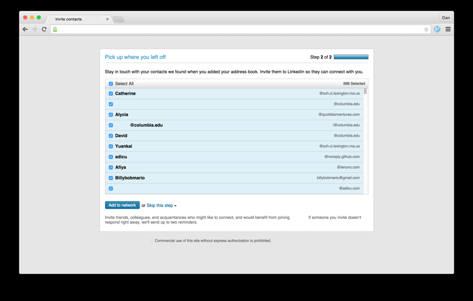
LinkedIn example of the Friend Spam dark pattern
Misdirection
The interface steers your attention to one thing in order to distract from another. Just as a magician uses misdirection to hide a trick, a UI might use visual weight or timing to hide crucial info. For instance, a mobile game might flash a big “CLAIM REWARD” button that actually also signs you up for a newsletter in the background. Or a site might design its color scheme such that the “Accept” option is a bright blue button and the “Decline” option is a pale grey link on a white background – technically visible, but easy to overlook. One common misdirection example: during software installs or account sign-ups, extra offers are pre-checked and mentioned in fine print, while the main “Next” button is large and inviting. Unless you’re vigilant, you’ve unknowingly agreed to the add-ons. Misdirection plays on our tendency to follow visual cues. Ethical design, by contrast, gives equal prominence to all choices, especially when one is not in the company’s immediate interest.
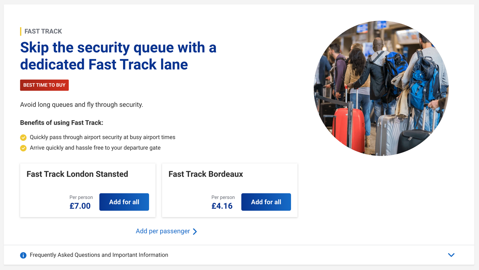
The Ryanair site uses “misdirection” dark patterns to push extras. For instance, big central buttons promote “fast track” options, making them easy to click by mistake when scrolling past.

Even after a customer declines, Ryanair shows another popup with a prominent button—often changing its color and title to disguise it as a new offer and mislead attention.
Ryanair repeatedly pushes the same upsell offers, asking multiple times in hopes customers change their mind, or slip up due to the site’s manipulative dark patterns, boosting the chance of impulse or accidental purchases.
Disguised Ads
Ever tried to click a download link, only to realize it was an ad in disguise? Disguised ad designs integrate advertisements so they look like genuine content or interface elements. This could be an interstitial ad that has a fake “X” close button – you think you’re closing the ad but actually open the link. Or an ad that looks like a chat message or system notification (“Your phone is infected! Tap to clean”). Such ploys not only annoy users; they can also lead to malware or scams. Modern UI guidelines strongly recommend labeling ads clearly, like Instagram’s “Sponsored” tag on posts, because user trust nosedives when they feel tricked into clicking ads. For startups, it’s better to be upfront about promotional content than to jeopardize credibility for a few ad clicks.

Softpedia disguises ads as download buttons to boost revenue. These fake buttons mimic the real ones, tricking users into clicking ads instead of downloading the software.
Privacy Zuckering
Named after Mark Zuckerberg, this pattern tricks users into sharing more information publicly than they intended. Social media platforms have repeatedly been guilty of this: from Facebook’s ever-shifting privacy settings that default to more sharing, to apps that nag you for phone contacts or location access without a clear reason. A classic example: Facebook once asked users for phone numbers for account security (two-factor authentication), but then used those numbers for ad targeting and friend suggestions without consent. Users and regulators alike were livid; it sparked widespread criticism and became a textbook case of how not to handle user data. Privacy zuckering extends to any design that makes opting out of data sharing onerous. Cookie consent banners are a battlefield for this right now – many sites made “Accept All” a big obvious button, but hid the “Reject” option behind multiple clicks, effectively coercing consent. In 2022, France’s data authority fined Google and Meta a combined $238M for such tactics, citing the “abuse of dark patterns” to subvert user choice on cookies. The takeaway: Respect privacy choices. If your app needs data, ask in a straightforward way and make “no thanks” as easy as “yes.”

Privacy Zuckering is a dark pattern that tricks users to disclose more personal information than the users had intended to.
Nagging
Nagging is how apps chip away at users’ willpower. Every pop-up, prompt, or nudge eats a little time and attention, like a hidden tax on saying “no.” Over time, those tiny costs pile up until the easiest path is to just give in, even if it’s not what the user wants. Example: In 2018, Instagram wouldn’t take “no” for an answer on notifications. The prompt kept returning for months, and the only real option was “Not Now” - a guaranteed ticket to more nagging later.
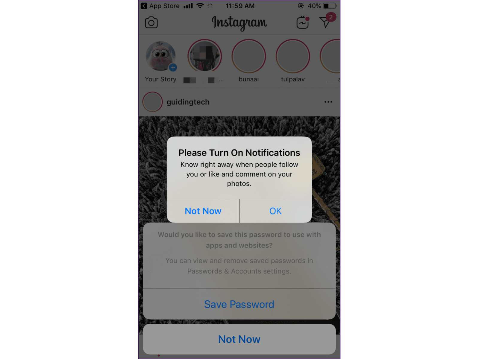
Nagging by Instagram
Fake social proof
The fake social proof trick is all about manufacturing credibility. By sprinkling in fabricated reviews, glowing testimonials, or fake “recent activity” messages, companies exploit the social proof bias – the human tendency to follow the crowd. It’s psychological sleight of hand: instead of evaluating a product on its merits, users are nudged to trust the illusion of popularity. The cost is subtle but powerful – decisions are shaped not by facts, but by fiction. For example, marketing automation firm Beeketing built a plugin called Sales Pop, designed to overlay messages like “Alycia in San Francisco just bought this item 4 minutes ago” or “9 customers purchased this item with item Y.” The kicker? Beeketing’s own documentation shows store owners how to randomize names, times, and locations, essentially generating a steady stream of fake purchases. What looks like bustling demand is, in reality, a carefully staged performance meant to push hesitant shoppers over the edge.
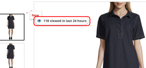
Activity Notification on jcpenney.com highlighting the number of people who viewed the product in the last day.
Fake scarcity
Fake scarcity manufactures urgency by creating the illusion that a product is about to run out. Misleading stock counters or inflated demand messages trick users into fearing they’ll miss out if they don’t act fast. It’s a direct play on the scarcity bias: our instinct to place higher value on things that seem rare or exclusive, pressuring people into rushed decisions instead of thoughtful ones. Example: HeyMerch, the company behind the Shopify app Sales and Stock Counter, openly equips store owners with tools to display false low-stock and sales messages. Their own promotional materials show how merchants can flip a few settings to generate phony “only 2 left in stock” warnings or inflated purchase counts. The result: a fabricated sense of urgency that drives conversions by preying on users’ fear of missing out.

Fake scarcity example
Fake urgency
Manufactured urgency is one of the oldest tricks in the digital playbook. When users are placed under artificial time pressure, their ability to weigh options collapses. Anxiety spikes, critical thinking dips, and they’re nudged into acting fast, often against their own best interest.
One of the most brazen examples lives inside the Shopify ecosystem. The app Hurrify, built by a company called Twozillas, lets merchants plaster ticking countdown clocks across their stores. To the shopper, it’s a high-stakes moment: a flashing, animated timer warning that the sale ends the instant it hits zero. But behind the curtain, in the admin dashboard, the truth is laid bare. The default setting is chillingly simple: “Run the campaign all over again.” When the clock expires, it quietly resets itself, over and over, forever. What looks like scarcity is, in reality, an infinite loop of deception, urgency engineered not to inform but to manipulate.
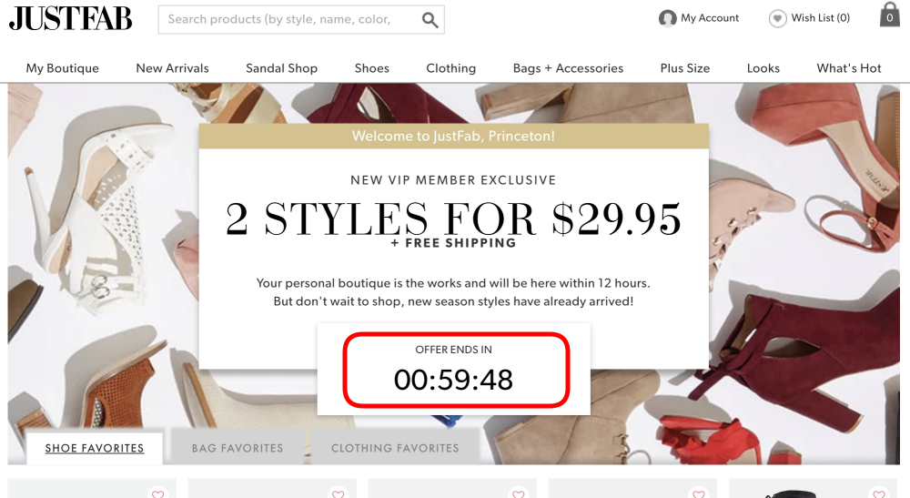
Fake timer example
As a founder or designer, you don’t need to memorize every dark pattern name. You just need to remember the common thread: dark patterns are designs that trick, coerce, or deceive users, rather than serving them. Whenever you’re considering a design decision, ask yourself – am I being fully honest and transparent with my users here? If the honest path seems likely to reduce conversions, the solution isn’t to deceive; it’s to rethink your value proposition or how you’re communicating it. Users appreciate clever solutions, but they resent clever tricks.
How Users and Regulators Are Fighting Back
For a while, dark patterns proliferated under the radar – individual users might feel annoyed or swindled, but the complaints were isolated. That’s changing fast. Users have become more vocal, and thanks to social media and communities, a deceptive UX can be exposed and go viral overnight. Designers themselves are increasingly calling out dark patterns, sharing egregious examples on Twitter and Reddit for all to see. There’s even a public website (Deceptive.design, formerly DarkPatterns.org) that maintains a “Hall of Shame” of dark pattern examples and the brands responsible. If you employ shady design on a popular product, don’t be surprised to find screenshots of your app trending online with scathing commentary.
Beyond the PR hit, the legal landscape has shifted dramatically. Regulators in both the U.S. and EU have made dark patterns a priority. The U.S. Federal Trade Commission has explicitly warned that it’s “ramping up enforcement” against dark patterns that “trick or trap” consumers. In late 2022, the FTC published a staff report “Bringing Dark Patterns to Light” and followed up by suing multiple companies in 2023 for deceptive designs. We saw the Amazon case – a high-profile example – but even lesser-known players aren’t safe. The FTC went after Publishers Clearing House (the sweepstakes company) for using dark patterns on its website, forcing an $18.5M settlement. In that case, PCH’s site had misled people to think buying something was necessary to enter the contest, via intentionally confusing design. The message from regulators: if you design an interface to undermine user intent, it can be deemed an “unfair or deceptive practice” and you can be held liable.
State laws are piling on too. California’s Consumer Privacy Act (amended by CPRA) flat-out says that consent obtained through dark patterns is invalid. Colorado and Connecticut have similar clauses defining dark patterns as UX that “subvert or impair” user choice. These laws essentially forbid using deceptive interfaces to get users to agree to things, especially around personal data. And while enforcement is still ramping up, it means startups need to be careful: manipulative cookie banners, obscured privacy settings, or sneaky pre-check boxes could land you in legal hot water. For example, under the GDPR in Europe, if you make it harder to refuse cookies than to accept them, authorities see that as not a freely given choice, resulting in those big fines for Google and Meta.
The EU is taking a broad approach with the new Digital Services Act (DSA), which explicitly bans platforms from using dark patterns to manipulate user behavior. Violations could cost up to 6% of a company’s global revenue. European regulators even ran coordinated sweeps of websites and mobile apps to sniff out dark patterns. In one sweep of 399 e-commerce sites, 148 sites (37%) were flagged for fake countdown timers, hidden info, or visual trickery pushing users into decisions. Those companies were told to fix their UX or face enforcement.
Crucially, investors and tech leaders are also waking up to the issue. A startup known for tricking its users risks developing a toxic reputation in the industry. We live in a time when ethical tech is a growing movement; users and employees alike want to align with companies that have a conscience. Venture capitalists have started to ask founders not just “how will you grow?” but “how will you grow responsibly?” If your growth plan relies on dark patterns, that’s a red flag. It signals short-term thinking and potential liabilities. On the flip side, focusing on user-centric design can be a selling point – it shows you’re building a brand for the long haul, based on trust and loyalty.
In summary, the cost of dark patterns has gone up sharply. Users may not spot every trick immediately, but when they do, their backlash is fierce. Regulators are actively hunting for deceptive designs and happy to make examples out of offenders. And every dark pattern you deploy is a seed of distrust planted in your user base. For startups, trust is everything – it’s what turns early adopters into evangelists, and what convinces customers to stick with you even if a competitor comes knocking. As the saying goes, “Trust is earned in drops and lost in buckets.” Dark patterns might gain you a drop of revenue today, but they can dump a bucket of user distrust on your head tomorrow.
Ethical Alternatives and Better Practices
The good news is that avoiding dark patterns doesn’t mean sacrificing success. In fact, many startups have thrived by doing the opposite – by championing user-friendly, ethical design as a core value. Designing with transparency and respect isn’t just the right thing to do, it’s also a savvy long-term strategy. Here are some guiding principles and concrete alternatives for founders and designers looking to build products that grow sustainably:
Put Users First: This might sound like Design 101, but it bears repeating. Every time you design a flow, ask “Is this in the user’s best interest, or just ours?” Aligning the two is key to longevity. For instance, if an e-commerce site is tempted to sneak an item into the basket, consider the user’s perspective – that trick might boost today’s revenue, but it will likely ensure the user never shops with you again. Instead, focus on user delight and solving their problems, and trust that satisfied users will drive growth through repeat usage and word-of-mouth. A product that genuinely helps users doesn’t need deceptive crutches.
Transparency by Design: Make honesty a design principle. This means clear labels, straightforward language, and no hidden actions. If you have a subscription, show the price and renewal period prominently before the user signs up. If your app wants location access, explain in the prompt exactly why and make it easy to say no. Consider the approach of some privacy-forward companies, for example, when Apple introduced privacy “nutrition labels” and a big “Ask App Not to Track” option, it set a high bar for transparency. User-centered designs build trust, encourage loyalty, and create lasting relationships. Those relationships are gold for a startup.
Simplify Opt-Out and Cancellation: Make the exit as easy as the entrance. Many users will try a new service because they know they can easily cancel if it’s not for them. If they sense a trap, they won’t even give you a chance. Adopt the mantra that cancellation or opting out should be doable in as few steps, as signing up. Companies like Netflix, for example, earned goodwill early on by allowing users to cancel online anytime with no penalties – and guess what, a lot of those users came back later because they remembered the experience was painless. Empower your users with control, and they’ll reward you with loyalty.
No Prechecked Boxes: In ethical design, opt-in means opt-in. Don’t assume consent by default. If you want users to subscribe to a newsletter, leave the checkbox unchecked and let them decide. If you’re asking for extra permissions or offering add-ons, require an explicit action. This not only avoids dark patterns, it also ensures you’re building an audience or user base that truly wants what you offer. The quality of your engagement will be higher. And legally, you protect yourself from claims of misleading users.
Embrace Ethical Persuasion: Not all persuasion is evil. There’s a difference between influence and manipulation. Guiding users to beneficial actions – like filling out their profile for a better experience, or nudging them to try a feature they overlooked – can be done ethically. The key is honesty and respect. For example, instead of using fear or guilt in a prompt, frame it positively: explain the value of the action to the user and make it their choice. If they decline, respect that and don’t punish them with incessant nagging or reduced functionality. Ethical persuasion is about educating and encouraging, not tricking.
Measure What Matters: Startups live and die by metrics. But make sure you’re tracking metrics that align with long-term health, not just vanity numbers boosted by dark patterns. Instead of only measuring how many people clicked “Accept” on something, measure how many active, happy users you have, or how many referrals you get (a sign of user satisfaction). Track retention and engagement over time, if you see spikes followed by churn, that could be a red flag that users felt tricked into signing up. Some UX teams advocate adding a “trust KPI”, like user satisfaction ratings or Net Promoter Score, to balance growth metrics. It’s important to align user satisfaction with business objectives and show clients/stakeholders that you can meet goals without resorting to manipulative practices.
Learn from the Cautionary Tales: As we’ve highlighted, many big-name companies have been burned by dark patterns – Amazon, LinkedIn, Facebook, to name a few. As a startup founder, use those stories as guideposts. If you ever find yourself rationalizing a sketchy design by saying “well, [BigCo] does it,” remember that [BigCo] also faced lawsuits, fines, or PR disasters for doing it. Regulators are often extra harsh on repeat offenders precisely to set an example. So learn from their mistakes for free. Also, being a smaller company doesn’t give immunity – authorities have penalized small startups too. The advantage of being small is you can build a positive reputation from the ground up. It’s hard for a Google or Meta to be seen as champions of privacy now given past behaviors, but you can be the startup that proudly tweets, “We just made our opt-out process even easier!” or “We’ve published our UX ethics policy.” There’s a growing segment of users who will choose a product because they appreciate its stance on transparency.
In essence, the antidote to dark patterns is building with integrity. This doesn’t mean your app can’t be engaging, sticky, or even a little bit persuasive. It means any engagement or stickiness comes from genuine value and clever design, not from boxing users into a corner. Think of successful products that users adore: they almost always respect users’ time, intelligence, and choices. As an entrepreneur, you want passionate users who rave about you, not ones who feel like they need to rage about you on forums because they feel cheated. Every interface choice is a chance to either build trust or chip away at it.
Conclusion
Dark patterns might offer a shortcut to certain metrics, but as we’ve explored, they’re a short-sighted strategy. Deceptive UX is essentially a betrayal of user trust – and in the startup world, trust is one of your most precious assets. You might get a temporary bump in revenue or sign-ups, but the long-term fallout (user dissatisfaction, churn, brand damage, legal penalties) far outweighs those gains. Startups should be especially wary, because a hit to your reputation or a hefty fine early on can be an existential threat.
On the flip side, committing to ethical design can be a competitive advantage. In an era where consumers are cynical about tech and hungry for products they can believe in, being the startup that “does it right” earns you kudos. Users will notice if your app asks for permissions in a considerate way, or if your checkout is refreshingly straightforward about pricing. Over time, that translates into a loyal user base and positive word-of-mouth.
In the end, building a product is like building any relationship – trust and honesty form the foundation. Dark patterns are breaches of that trust. So avoid the tricks and traps, and choose the path of open, user-centered design. Not only will you sleep better at night, but you’ll also likely find that happy users stick around, spend more, and bring their friends. And that is the kind of sustainable, healthy growth every startup should aspire to. In the battle for user loyalty, playing fair is the sharpest weapon you have. Good luck ✌️
Dark Patterns FAQ
What exactly are “dark patterns”?
Dark patterns are UX tricks designed to push users into doing things they didn’t really want to do — like subscribing, sharing data, or spending money. They look like normal UI, but their intent is manipulation, not help. If good UX says “Here are your options”, dark UX says “I’ve already chosen for you, you just didn’t notice.”
Are dark patterns illegal?
Sometimes, and increasingly so. Many dark patterns now violate consumer protection laws, including: EU Digital Services Act (DSA), GDPR, California Consumer Privacy Act (CCPA), FTC deception rules. Things like forced opt-ins, fake scarcity, or hidden unsubscribe flows can trigger fines, lawsuits, or app store removal. In 2026, regulators actively audit apps for manipulative UX.
Why do so many companies still use them?
Because they work in the short term. Dark patterns increase conversion, reduce churn, inflate metrics for investors. But they also destroy trust, increase refunds and chargebacks, kill long-term retention, create legal risk. They are growth hacks that poison the brand.
Isn’t this just “smart marketing”?
No. Smart marketing: “We showed people the value clearly.” Dark patterns: “We trapped people until they gave up.” If your product only grows when users are confused or exhausted, you don’t have product-market fit. You have psychological leverage.
Do dark patterns actually hurt retention?
Yes, brutally. Users who feel tricked leave faster, complain louder, trust you less, never come back. You might win one conversion… and lose ten future ones. This is why so many apps have high installs and low loyalty.
How can I audit my own product for dark patterns?
Ask these five questions:
Can users clearly understand what they’re agreeing to?
Can they easily cancel or undo actions?
Are we hiding important information?
Are we using fear, guilt, or confusion?
Would I be okay if this UI was used on my parents?
If the answer makes you uncomfortable — you found a dark pattern.
What are the most common dark patterns in apps?
The usual suspects:
Fake “Only 2 left!” urgency
Pre-checked subscription boxes
Hidden unsubscribe buttons
Guilt-tripping copy (“No thanks, I hate saving money”)
Confusing pricing tiers
Sneaky data-sharing toggles
If it feels slimy, it probably is.
Do users really notice these things?
They may not always know what happened, but they always know how it made them feel (e.g., confused, tricked, annoyed, betrayed). And those emotions attach to your brand.
Can a startup survive without dark patterns?
The best ones do. Products that win long-term, e.g., Netflix, Spotify, Notion, Apple, Airbnb. They focus on: Clarity, Trust ,Habit, Value. Not psychological traps.
What should I do instead?
Design for consent, not coercion. That means transparent pricing, honest copy, simple cancellations, clear choices, respect for user time. Trust is the highest-ROI growth strategy.